رؤى للتجار
How to Customize Your Online Store Design Without Code
نُشر في September 2, 2026

Templates, mobile-first layout, RTL Arabic typography, Core Web Vitals and trust signals: how to customize online store design without code and actually convert.
You can customize online store design without code, and in 2026 that is not a compromise. It is how most serious merchants in Riyadh, Dubai, Berlin and Paris actually build. You start from a template, you change a short list of settings, you replace the imagery and the copy, and you resist the urge to touch everything else.
Most stores I audit do not have a taste problem. They have a hierarchy problem. Three carousels before the first product. A logo tall enough to push the catalogue below the fold. An add-to-cart button in the same shade as the background. A price rendered in light grey at 13 pixels because it looked elegant on a designer's 27-inch monitor. Shoppers do not think "this is ugly". They think "I do not understand", and they leave almost immediately.
This guide is a practitioner's checklist: what to change, in what order, with numbers you can check yourself. It assumes you already have a store or are about to open one. If you have not started, read how to create an online store without coding first, then come back for the design work.
Design That Converts Beats Design That Impresses
There are two ways to judge a storefront. The aesthetic one asks whether you like it. The functional one asks whether a distracted stranger, on a phone, on a mid-tier mobile connection, can tell within three seconds what you sell, what it costs, what happens if it does not fit, and where the buy button is. Only the second question moves revenue.
Everything else — parallax, gradients, hover animations, background video — is comfort. When elegance and clarity collide, ship clarity.
What It Means to Customize Online Store Design Without Code
No-code customization runs on exactly three levers.
The template. It decides the skeleton: grid density, header behaviour, product page layout, checkout flow. Choosing the right one is 70 percent of the design job, and it takes ten minutes. Picking among the best online store templates is not about which screenshot is prettiest, it is about which one matches your catalogue shape.
The settings. Primary colour, action colour, logo, typeface, corner radius, which home sections appear and in which order. Menus and colour pickers, nothing more.
The content. Photography, copy, categories, banners. This is the most powerful lever and the most neglected one. Two stores on the same template with the same palette can convert very differently, because one has consistent product shots and honest descriptions and the other does not.
What you do not do without code: move a button by three pixels, invent a novel layout, bolt on a component that does not exist. That constraint is a feature. It is exactly where most hand-built stores destroy their own usability.
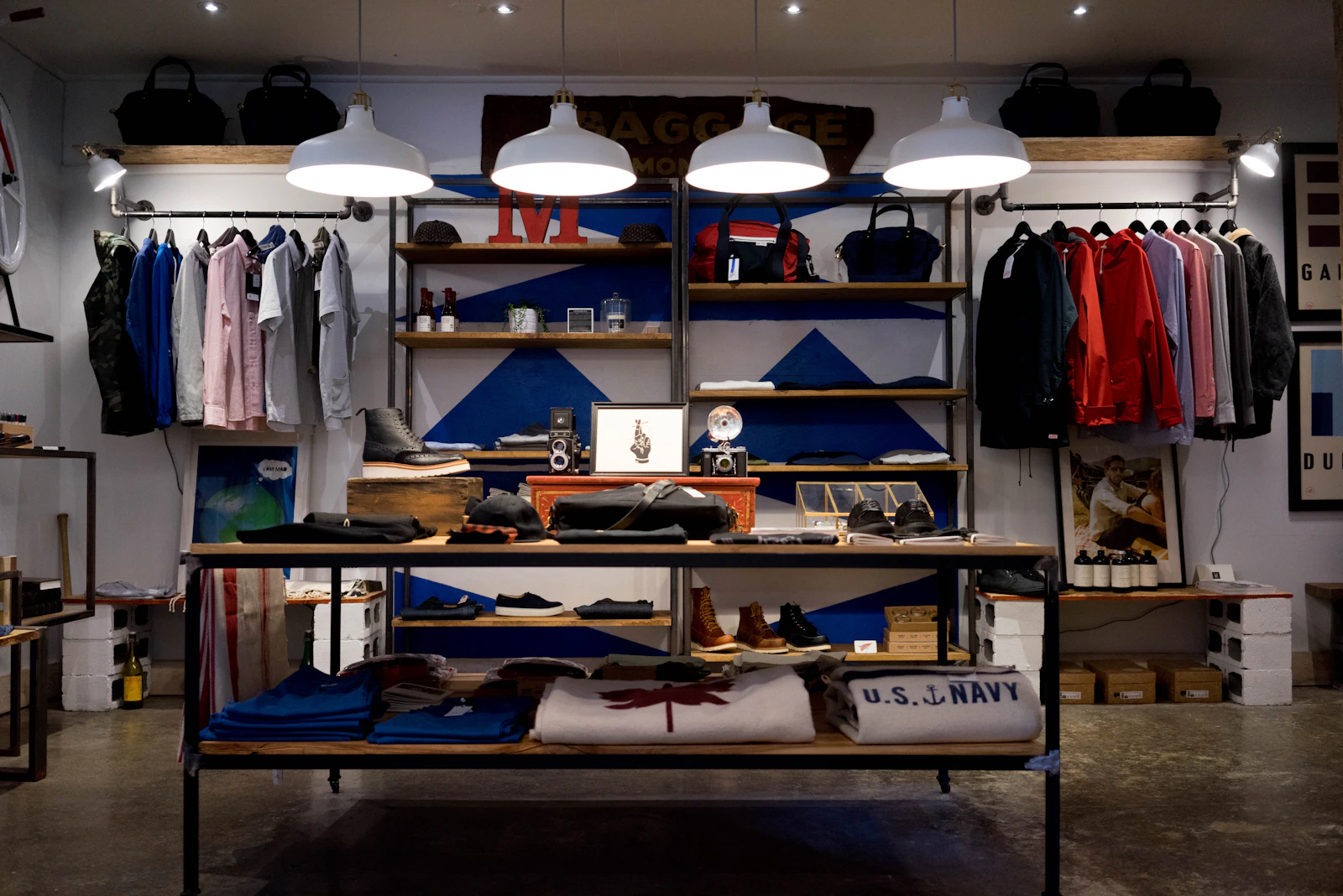
Home Page Hierarchy: Five Blocks, In Order
A home page is a junction, not a trophy cabinet. Its only job is to move visitors to a product page quickly.
- One hero banner with a promise of six words or fewer and a single button. Not a five-slide carousel: slides beyond the first are effectively invisible and they cost load time.
- A reassurance strip: delivery time, payment options, returns, contact.
- Featured products: six to eight items, photo, short name, visible price. This block generates the clicks.
- Categories: four to six tiles, no more.
- Social proof: three reviews with a first name and a city, or a screenshot of a real customer message.
If your home page has more than seven blocks, delete some. Every extra block adds weight, latency and one more decision for a shopper who did not ask for one.
Product Page Design That Converts
This is the page that receives search traffic and ad clicks, so it deserves most of your attention. Above the fold on a phone you need the square or 4:5 hero image, the product name on two lines maximum, the price in bold at a larger size than body copy, variant selectors as tappable chips rather than dropdowns, and a full-width buy button in a colour that appears nowhere else.
Below the fold: three bullet points, shipping cost and delivery window, return policy, reviews, then the long description. Order matters — nobody reads brand storytelling before knowing the delivery fee. For the copy itself, see how to write product descriptions that sell, and for how that page gets found, SEO for ecommerce product pages.
Checkout: The Design Where Money Leaks
Three rules cover almost all of it.
One page. Name, phone, address, payment method, submit. Every additional field costs orders. Never force account creation before purchase.
Local payment methods first, in the right order per market. In Saudi Arabia that means mada and Apple Pay near the top; mada is a Saudi domestic scheme only, so in the UAE you lead with cards and Apple Pay instead, and in both markets cash on delivery stays clearly visible. In Europe it means the domestic favourite first — iDEAL in the Netherlands, cards and SEPA elsewhere, buy-now-pay-later where it is expected. See payment gateways in Saudi Arabia and payment methods in Europe.
Shipping cost announced early. A fee revealed on the last screen is the single largest cause of abandonment. Put it on the product page. More tactics in reduce cart abandonment.
Mobile First Store Design, Not Mobile Tolerated
Across the Gulf, the large majority of retail sessions arrive from a phone, and in Western Europe mobile is a majority too. Designing on a desktop and then checking that it "works on mobile" is how stores get ruined.
Check these on a real handset:
- Logo height under 60 pixels so products stay above the fold.
- Menu collapsed, five entries maximum.
- Tap targets at least 44 by 44 pixels, with 8 pixels of separation.
- Two products per row in the grid, never three.
- Numeric keypad triggered by the phone field.
- Buy button reachable while scrolling a long product page.
Background and benchmarks in the mobile commerce guide.
Speed Is Part of the Design
Core Web Vitals sound like an engineering topic. In practice they are three plain questions: how fast does the main image appear (Largest Contentful Paint, aim under 2.5 seconds), does the page jump around while loading (Cumulative Layout Shift, aim under 0.1), and does the first tap respond quickly (Interaction to Next Paint, aim under 200 milliseconds).
Images are almost always the heaviest part of a store page — routinely around half of its total weight — so most of the fix is a design decision, not a code one.
| Asset | Sensible budget | Common mistake | Consequence |
|---|---|---|---|
| Product photo | 100 to 200 KB | 4 MB export straight from a camera | 3 to 6 seconds on mobile data |
| Home hero | 200 to 350 KB | Uncompressed full-width PNG | Poor Largest Contentful Paint |
| Logo | under 30 KB | 3000 pixel wide artwork | Slows every single page |
| Background video | avoid | 12 MB looping clip | Burns the shopper's data plan |
| Web fonts | two families maximum | Five imported families | 200 to 400 ms of blocking |
Practical no-code fixes: export at 1600 pixels wide, let the platform serve modern formats, enable lazy loading for anything below the fold, reserve fixed dimensions for images so the layout stops shifting, and cut your font list to two.
RTL and Arabic Typography: The Classic Template Trap
Most templates are designed around Latin script, and switching a store to Arabic is not translation, it is mirroring the layout.
What must flip: logo and menu position, text alignment, carousel arrow direction, breadcrumb order, cart icon placement, table column order, and margins. What must not flip: phone numbers, prices, order references, and SKUs.
Typography matters more than merchants expect. Arabic needs roughly 10 to 15 percent larger type than Latin for equal legibility, and noticeably more line height: 1.7 to 1.9 against 1.5. Arabic glyphs carry dots and descenders that collide when lines are tight. Keep decorative Arabic typefaces for the logo and never for body copy.
A ninety-second test: open the Arabic version on a phone and confirm that the menu moved, the text aligns right, and the back arrow points the correct way. If any of those fail, your Arabic conversion rate will stay far below your English one. Related reading: Arabic SEO for Google in Saudi Arabia and running a multi-currency, multilingual store.
Store Branding Without a Designer
You need three colours, not twelve.
- A background: white or off-white. Dark themes look striking and then fight every product photo shot on a white sweep.
- A text colour: very dark grey rather than pure black, easier on screens.
- An action colour: reserved exclusively for the buy button. If your promo ribbon and your add-to-cart share a colour, neither one stands out.
For the logo, the honest version is that your name set cleanly in one legible typeface, in one colour, is enough to launch. An intricate emblem becomes mush at 40 pixels tall, which is how most people will ever see it. Keep a square version for social profiles and a horizontal one for the header. Longer-term brand work is covered in building a brand around your online store.
Product photography follows the same logic: window light, no flash, one plain background, and three fixed shots per item — full product, material detail, product in use. Consistency beats brilliance; ten identical average shots outperform three great ones surrounded by seven mismatched ones. Setup details in product photography tips for online sellers.
Trust Signals: Gulf Versus Europe
The list of what reassures a shopper is not universal, and copying a template's default footer from another market costs orders.

| Trust element | Gulf (Saudi Arabia, UAE) | Europe |
|---|---|---|
| WhatsApp contact button | Expected, often decisive | Rarely expected, email or chat instead |
| Cash on delivery visibility | Strong signal, show it early | Marginal, can look unprofessional |
| Return policy | Short, plain, near the buy button | Legally framed, withdrawal period stated |
| Company identity | Commercial registration and location | Full legal notice, company number, VAT id |
| Payment logos | mada in Saudi Arabia, Apple Pay and cards region-wide | Domestic scheme first, then cards |
| Delivery promise | Named regional carrier and city timing | Carrier, tracking and estimated date |
| Privacy and consent | Clear data statement | Cookie consent and GDPR compliance |
Europe adds hard requirements rather than nice-to-haves. Work through the GDPR checklist for online stores before launch, and if you sell across Gulf borders, remember that VAT rules differ by country, as explained in VAT for online stores in the Gulf.
Accessibility Basics That Also Sell More
Accessibility is comfort, and comfort converts.
- Contrast. Light grey on white is unreadable in sunlight, and a large share of your shoppers are outdoors. Keep strong contrast in body copy and inside buttons.
- Type size. 16 pixels minimum for body text on mobile. Below that, some browsers auto-zoom form fields and wreck your checkout layout.
- Tap targets. 44 pixels minimum, 8 pixels apart. Adjacent links produce mis-taps, back-navigation and abandonment.
- Alt text. Descriptive alternative text serves screen readers and image search at the same time.

Ten Design Mistakes That Send Shoppers Away
- Shipping cost revealed only at the last checkout step.
- A buy button that blends into the background.
- Prices in small light grey, or missing from the category grid entirely.
- An oversized logo that pushes the catalogue below the fold.
- A five-slide hero carousel where nobody ever sees slides two to five.
- A cookie or consent banner that sits on top of the buy button on mobile.
- An English-only checkout on a store whose ads run in Arabic.
- Mixed image ratios and backgrounds inside a single grid.
- A newsletter pop-up in the first second on mobile, with a close icon too small to hit.
- No visible contact method, plus autoplaying audio or video for good measure.
Each of these costs orders on its own. The first four are usually a single working session.
What You Gain By Not Customizing Everything
This is the least intuitive advice here and the most profitable. A professional template has already settled a hundred micro-decisions on your behalf: column widths, vertical rhythm, heading scale, tablet menu behaviour, checkout field order, button contrast. Every time you force a setting against the template, you risk breaking a balance you did not design.
Concrete benefits of staying close to the default:
- Time. A disciplined pass over the settings fits in an afternoon. A redesign eats a month in which nothing new ships.
- Upgrades. Standard templates keep inheriting platform improvements for free. Heavily bent ones turn into special cases somebody has to maintain.
- Familiarity. Shoppers do not reward originality, they reward recognising where the cart is.
- Measurability. Change a dozen things in one evening and a sales dip tells you nothing. Change one, measure a week, keep or revert.
The practitioner rule: customize the logo, three colours, home block order and your content. Leave everything else alone for the first three months. If you are still weighing tooling, the comparison of no-code ecommerce platforms and no-code versus hiring a developer frame the trade-off honestly, and the one-hour launch checklist covers the sequencing.
Frequently Asked Questions
Can you really customize an online store design without code?
Yes, for everything that affects revenue: template, colours, logo, typefaces, block order, imagery, copy, categories, navigation and footer. Code only becomes necessary for unusual requirements, which are almost never what limits a young store's sales.
How do I change my store theme without losing products?
Catalogue, orders and customer records are stored independently of appearance, so switching templates changes presentation and not data. Switch on a low-traffic day, then re-check four pages on a phone: home, one product page, cart and checkout, and confirm banner dimensions still fit.
What are the best online store templates for a small catalogue?
With fewer than thirty products, pick a template with large imagery and no deep category tree — a single-level menu and a generous product grid. Deep navigation designed for thousands of items makes a small catalogue feel empty.
How many colours should an ecommerce brand use?
Three: background, text and one action colour reserved for buttons. A fourth may serve promotions provided it never competes with the buy button.
Do I need a mobile app or is a mobile-first site enough?
A properly mobile-first site is enough to start and it captures search traffic, which an app cannot. Apps pay off once you have repeat buyers worth notifying, as covered in turning your online store into a mobile app.
Where To Start This Week
Do not rebuild your store. Open it on your own phone: home page, one product page, checkout. Write down every moment that required effort — a price you had to hunt for, a button you mis-tapped, an image that stalled. Fix those three things first. That is usually most of the gain available to you. Only then touch colours and logo, one change at a time, measured over a full week.
On Storilive, storefront templates, the visual editor and native Arabic with RTL layout are included from the Starter plan at 59 DT per month, with zero commission on orders and no setup fee. The Business plan at 79 DT per month adds AI-assisted catalogue import, advanced analytics with GA4 plus AI-generated product photos and copy, which is the fastest way to make an inherited catalogue look consistent. Two months are included when you pay annually, and you can cancel at any time.